Progress
Major design/rebrand overhaul for V1.1!
By Kyle
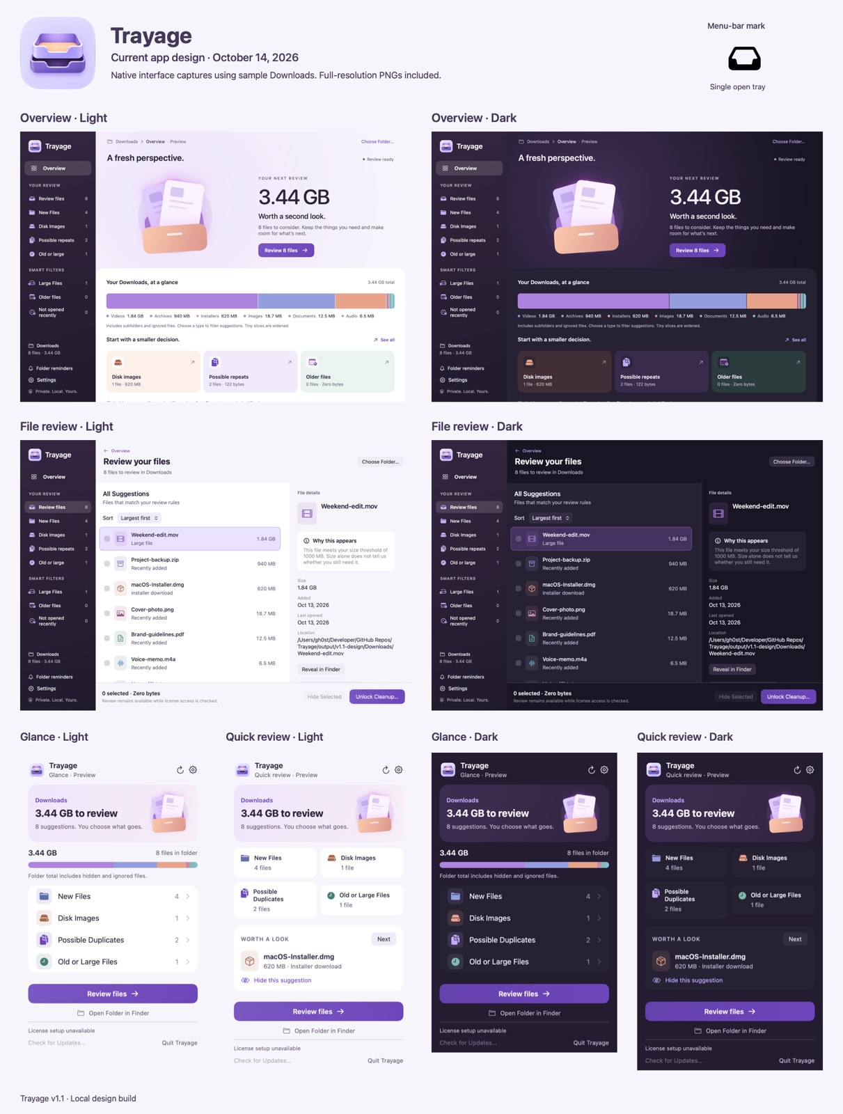
I’m giving Trayage a proper redesign for v1.1. Feedback made me step back and look at how clearly the app explains its value—why a file is worth reviewing, what you can do with it, and what happens next. And honestly, the original design felt dated. I wanted it to feel more inviting and easier to use. Here’s where the new direction is heading: - A clearer overview of files worth checking and the space they use. - Easier access to why each file was suggested, with an option to hide suggestions. - Two menu bar views so you can choose between a quick glance and a more detailed review. - Refreshed colors, light and dark appearances, and a new tray-inspired identity. You still choose what moves to Trash and confirm before anything moves. These are the current designs, and I’m still refining the details. The website is next so the whole experience feels consistent. What feels clearer here, and what would you still change?
Media
- Reactions
- 0
- Comments
- 0
- Shares
- 0